Canvas
Overview
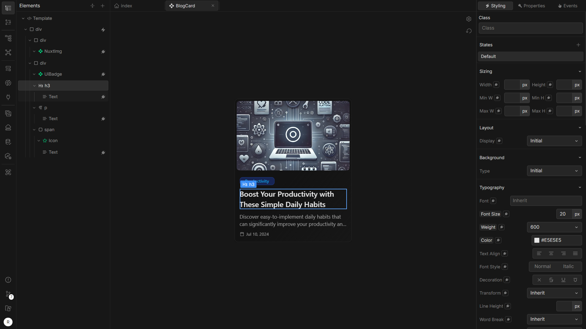 The Canvas area displays the component, page, or layout you are working on. It provides direct interaction with elements in real-time. When working with the canvas, you can:
- Hover over elements to highlight them.
- Click to select and edit the element.
Tip: If the selected element is a component, double-clicking it opens the component in a new tab. This makes it easier to edit subcomponents within a larger design.
Canvas Settings
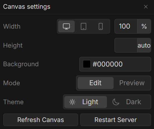 Located at the top-right of the Canvas, the Settings icon opens options to configure Canvas properties:
- Canvas Size: Adjust the width and height of the Canvas to simulate different screen sizes.
- Background Color: Set the background color to check your component’s compatibility with various themes.
- Edit Mode and Preview Mode:
- Edit Mode: The default mode for modifying elements and components.
- Preview Mode: Allows you to see how the component behaves and interacts with data in real-time.
- Theme Toggling: Switch between light and dark themes to see how your design adapts to different color schemes (e.g., through Tailwind’s dark theme).
- Refresh and Restart Options: Refresh the Canvas to clear its current state or reset the data, or restart the server to reload the entire project.
Canvas Zoom and Positioning
- Zooming: Use
Ctrl+ scroll to zoom in and out, allowing you to focus on detailed elements or view the overall layout. - Panning: You can pan across the Canvas using the middle mouse button or by pressing
Space+ left-click.
Tip: Use the reset position icon (below the canvas settings icon) to reverts any zoom or panning adjustments back to default.
Context Menu
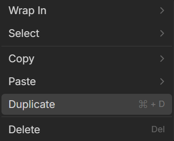 Right-clicking on a selected element opens a context menu with options for wrapping, selecting, copying, pasting, duplicating, and deleting elements.
1. Wrap In
The Wrap In option provides pre-defined wrappers like div, template, paragraph, or link. This feature wraps the selected element within the chosen HTML tag, making it flexible to adapt or group elements.
2. Select
Under the Select option, you can choose from:
- Parent Element: Selects the parent container of the current element.
- Previous Sibling: Selects the previous sibling of the current element.
- Next Sibling: Selects the next sibling of the current element.
3. Copy and Paste
The Copy option allows you to:
- Copy the element itself.
- Copy styles associated with the element.
- Copy event of the selected element.
Similarly, the Paste option enables you to paste the copied element, styles, or events directly into other elements, allowing for efficient duplication and customization.
4. Duplicate and Delete
- Duplicate: Instantly duplicates the selected element with all its properties, saving time when creating multiple similar elements.
- Delete: Removes the selected element from the Canvas.