Element Panel
The Element Panel is divided into three main tabs:
- Styling
- Properties
- Events
1. Styling Tab
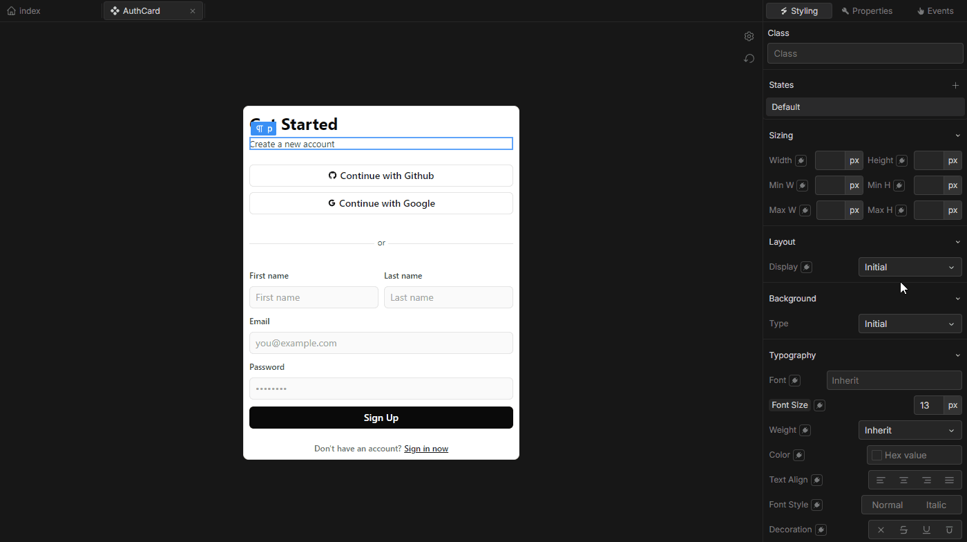 The Styling tab is where you can modify the visual appearance of the selected element. Changes made here are automatically converted to Tailwind CSS classes in the generated code. Below is a breakdown of key features in the Styling tab:
- Style Properties: Directly adjust core style properties such as width, height, background color, font, etc.
- Custom Classes: At the top of the Styling tab, an input field allows you to add custom CSS classes.
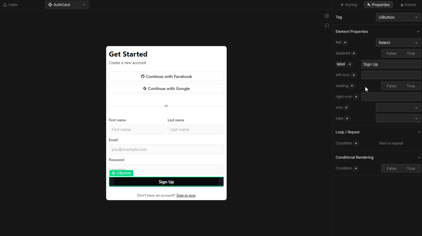
2. Properties Tab
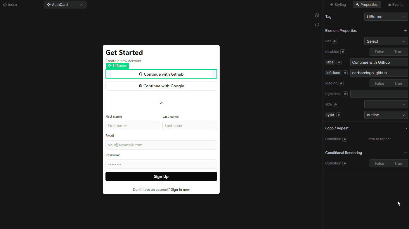 The Properties tab allows you to define and edit attributes, configure element tags, and set up conditional rendering and repeat logic. It is divided into several key sections:
Attributes
Add and edit element attributes, or pass properties to components.
Loop/Repeat
The Loop/Repeat option lets you repeat an element multiple times based on a array, object or number. Here’s how it works
- Condition Field: Add any dynamic data type (array, object, or number) to specify the number of repetitions.
- Repeat Key: Assigns a unique key to each iteration, ensuring unique identification.
- Current Item Name and Current Index Name: Define names to refer to each item and index within the loop, which are accessible as references within each iteration.
Learn more about list rendering from the Vue documentation on list rendering.
Conditional Rendering
Conditional Rendering lets you control element visibility based on dynamic conditions, similar to Vue's v-if directive.
- Condition Field: Specify a condition that must be met for the element to be rendered.
- Force Render: When enabled, this option ignores the specified condition and forces the element to render in the development environment. It’s useful when you want to view and edit an element without its condition influencing visibility.
For more on conditional rendering, see the Vue documentation on conditional rendering.
3. Events Tab
The Events tab is dedicated to adding and managing HTML event listeners on the selected element. Events provide interactivity, enabling user-driven actions and responses.
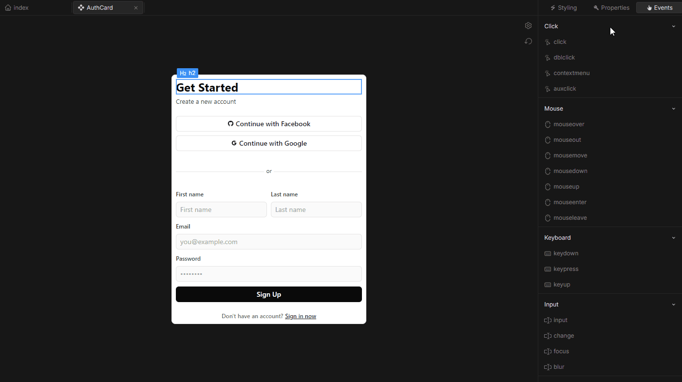 To add an event:
- Choose an event type (e.g., Click, Double-click, etc).
- After selecting an event, a popover called the Event Builder will appear on the left side of the Element Panel. The Event Builder allows you to define actions for the event, which are triggered when the event occurs. For example, selecting the “Click” event will display the Event Builder, where you can add actions to execute when the element is clicked.
Adding Dynamic Value
You can add dynamic values to various properties and attributes of elements. This feature is accessible through the "plug" icon located next to many property labels within the Element Panel.
 To add a dynamic value:
- Click the plug icon next to the property label.
- When you click the icon, a pop-up appears, where you can enter a dynamic value or expression to control the property based on variable data or external input.
This feature allows you to enhance the flexibility of your elements, adapting their appearance or behavior according to live data and user interactions.